Display-ready Wild West type for themed headlines
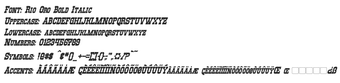
Rio Oro supplies a bold, decorative slab-serif look for posters, logos, and display headers, using heavy serifs and ornate letterforms to evoke classic American frontier signage. Designed by Neale Davidson of Pixel Sagas, the font suite includes four styles and over 236 glyphs, and it supports both OpenType and TrueType formats. It targets graphic designers and hobbyists who need a strong Western voice in display work and prefer scalable vector outlines for large-format output.
What the font changes about display typography
Rio Oro transforms display text into a marquee-style Western headline by applying heavy slab serifs and decorative terminals to each glyph. The design emphasises bold, high-impact letterforms intended for short, prominent text such as posters and logos rather than long body copy. The supplied vector outlines keep edges sharp when scaling for print or large digital banners.
How much typographic control the family offers
The family provides practical style options with four distinct variants: Regular, Bold, Italic, and Bold-Italic, which lets designers select weight and emphasis without mixing different typefaces. The package includes a full character set of more than 236 glyphs, accented characters, small caps, punctuation, and currency symbols, so multilingual display headers and varied typographic treatments are supported within the same family.
Installation, format support, and compatibility
Rio Oro installs and runs in standard design workflows. The download typically contains .otf and .ttf files, and the font works with applications that accept OpenType or TrueType files, including desktop design suites and office apps. The font is compatible with Windows, macOS, and Linux, so it integrates into cross-platform projects without format conversion.
A focused choice for designers needing authentic Western display type
Rio Oro suits designers who require a bold, period-specific headline face and expect multi-style options inside one family. Note that the font is licensed for personal use by default, so secure a commercial license before using it in client work. As a practical tip, reserve the face for large-scale headings and signage where its heavy serifs and detailed glyphs remain legible.